Express.js - Partials (hbs template)
What is Partials ?
In Handlebars, partials are reusable templates (UI components) that can be included in other templates , such as headers, footers and navigation bars etc.
Key Features of Partials
- Code Reusability : Avoids redundant code by using shared components.
- Scalability : Makes large applications easier to manage.
- Maintainability : Allows quick updates by modifying a single file.
File and Folder Structure
Organize your project with separate folders for views, public, and server files. This structure keeps the project manageable and scalable.
Setting up Express.js Server
Configure Express.js with Handlebars as the view engine and set up a basic server.
const express = require('express');
const path = require('path');
const hbs = require('hbs');

const app = express();

// Serve static files from the public directory
app.use(express.static(path.join(__dirname, 'public')));

// Set up handlebars as the view engine
app.set('view engine', 'hbs');

// Set the location of the views
app.set('views', path.join(__dirname, 'views'));

// Register the partials folder
hbs.registerPartials(path.join(__dirname, 'views/include'));

// Define routes
app.get('/', (req, res) => {
    res.render('home', { title: 'Home' });
});

app.get('/about', (req, res) => {
    res.render('about', { title: 'About Us' });
});

app.get('/contact', (req, res) => {
    res.render('contact', { title: 'Contact Us' });
});

const PORT = 5000;
app.listen(PORT, () => {
    console.log(`Server is running at http://localhost:${PORT}`);
});
Creating hbs Templates
i) Navbar Page
This code defines a navigation menu with links to the Home, About Us, and Contact Us pages. It organizes the links inside an unordered list ul tag for easy access and structured navigation.
<nav>
    <ul>
        <li><a href="/">Home</a></li>
        <li><a href="/about">About Us</a></li>
        <li><a href="/contact">Contact Us</a></li>
    </ul>
</nav>
ii) Footer Page
This code creates a footer section displaying a copyright notice for 'My Website' in 2025. It ensures legal protection and informs users that all rights are reserved.
<footer> <p>© 2025 My Website. All rights reserved.</p> </footer>
iii) Home Page
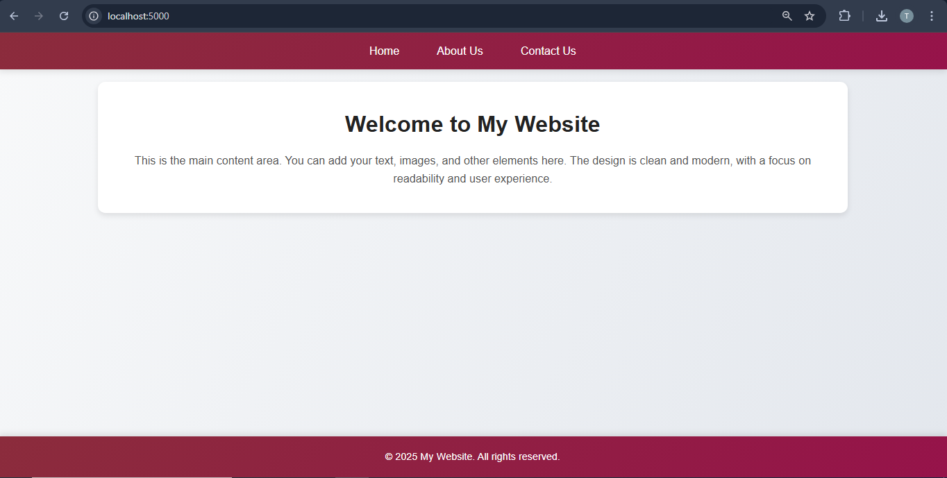
This template defines a structured webpage with a dynamic title, linked CSS for styling, and included navbar and footer partials.
<html>
<head>
     <title>{{title}}</title>
    <link rel="stylesheet" href="/style.css">
</head>
<body>
    {{> navbar}} <!-- This includes the navbar partial -->
    <main>
        <h1>Welcome to My Website</h1>
        <p> This is the main content area. You can add your text, images, and other elements here. The design is clean and modern, with a focus on readability and user experience. </p>
    </main>
    {{> footer}} <!-- This includes the footer partial -->
</body>
</html>
iv)About Page
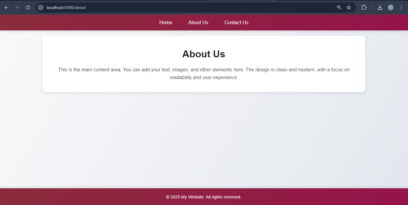
This template creates an About Us page with a dynamic title, linked CSS for styling, and included navbar and footer partials.
<html>
<head>
    <title>{{title}}</title>
    <link rel="stylesheet" href="/style.css">
</head>
<body>
    {{> navbar}}
    <main>
        <h1>About Us</h1>
        <p>This is the main content area. You can add your text, images, and other elements here. The design is clean and modern, with a focus on readability and user experience. </p>
    </main>
    {{> footer}}
</body>
</html>
v) Contact Page
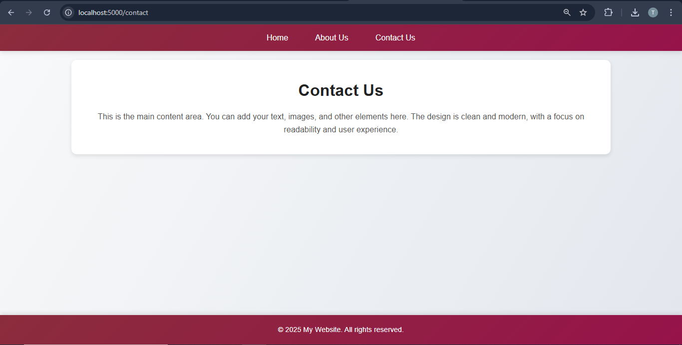
This template builds a Contact Us page with a dynamic title, linked CSS for styling, and reusable navbar and footer partials.
<html>
<head>
    <title>{{title}}</title>
    <link rel="stylesheet" href="/style.css">
</head>
<body>
    {{> navbar}}
    <main>
        <h1>Contact Us</h1>
        <p>This is the main content area. You can add your text, images, and other elements here. The design is clean and modern, with a focus on readability and user experience. </p>
    </main>
    {{> footer}}
</body>
</html>
vi) Create Style File
This CSS file defines the styling for the website, including a modern gradient background, navigation bar, content layout, and responsive design features.
/* Basic Reset */
* {
  margin: 0;
  padding: 0;
  box-sizing: border-box;
}

body {
  font-family: 'Poppins', sans-serif;
  line-height: 1.6;
  background: linear-gradient(120deg, #f8f9fa, #e3e7ed); /* Soft trending gradient */
  color: #333;
  display: flex;
  flex-direction: column;
  min-height: 100vh;
}

/* Navbar Styling */
nav {
  background: linear-gradient(135>deg, #8b2c3c, #96134a); /* Vibrant gradient */
  padding: 15px 20px;
  display: flex;
  justify-content: center;
  box-shadow: 0 4px 10px rgba(0, 0, 0, 0.1);
}

nav ul {
  list-style: none;
  display: flex;
  gap: 30px;
}

nav ul li a {
  color: #fff;
  text-decoration: none;
  font-size: 18px;
  padding: 10px 15px;
  transition: background-color 0.3s, transform 0.2s;
  border-radius: 6px;
}

nav ul li a:hover {
  background: rgba(255, 255, 255, 0.2);
  color: #fff;
  transform: scale(1.05);
}

nav ul li a.active {
  background: #ffcc00;
  color: #333;
  border-radius: 6px;
}

/* Main Content Styling */
main {
  padding: 40px 20px;
  max-width: 1200px;
  margin: 20px auto;
  background: #fff;
  box-shadow: 0 4px 10px rgba(0, 0, 0, 0.1);
  border-radius: 12px;
  text-align: center;
}

main h1 {
  font-size: 36px;
  margin-bottom: 15px;
  color: #222;
}

main p {
  font-size: 18px;
  color: #555;
}

/* Footer Styling */
footer {
  background: linear-gradient(135deg, #8b2c3c, #96134a); /* Matching gradient for footer */
  color: #fff;
  text-align: center;
  padding: 20px;
  margin-top: auto;
  box-shadow: 0 -4px 10px rgba(0, 0, 0, 0.1);
}

footer p {
  margin: 0;
  font-size: 16px;
}

/* Responsive Design */
@media (max-width: 768px) {
  nav ul {
    flex-direction: column;
    align-items: center;
    gap: 10px;
  }

  nav ul li a {
    display: block;
    width: 100%;
    text-align: center;
  }

  main {
    padding: 20px;
  }

  main h1 {
    font-size: 28px;
  }

  main p {
    font-size: 16px;
  }
}
Run the Server
Run the server using the command is given below.
node index.js
D:\my-app>node index.js
Server is running on http://localhost:5000
Output
Home Page
Renders the home page with a navbar, content, and footer.
About Page
Displays the about page with relevant content and a consistent layout.
Contact Page
Shows the contact page with a uniform design and navigation.